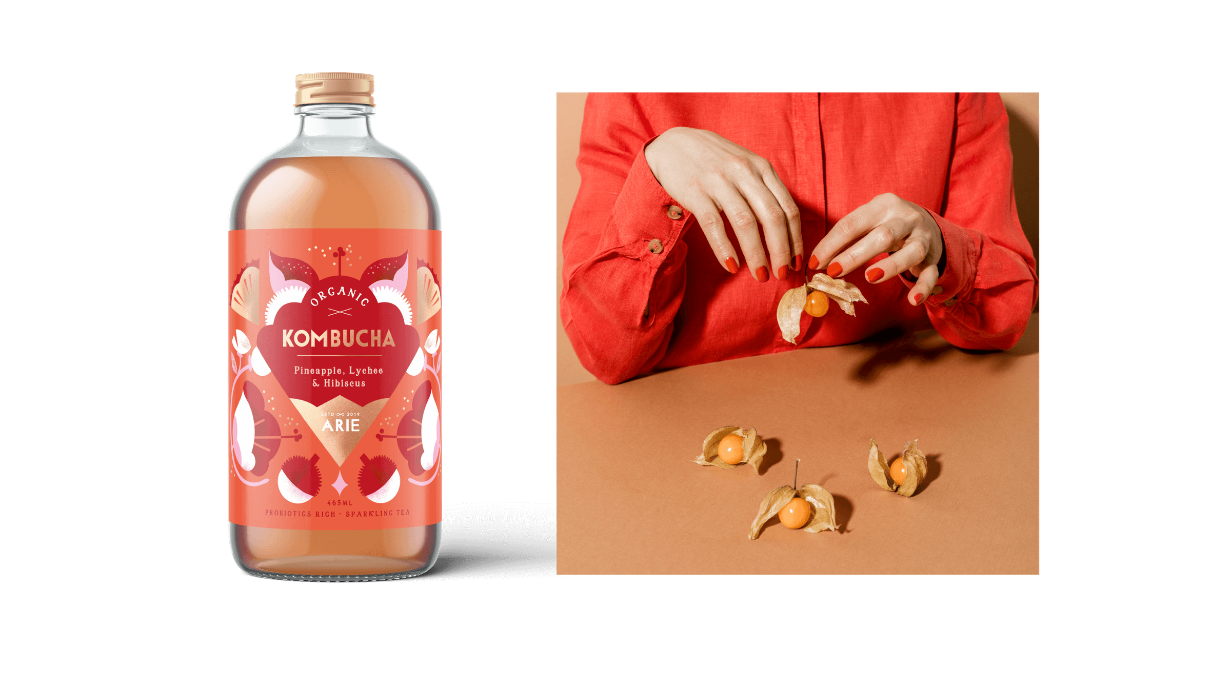
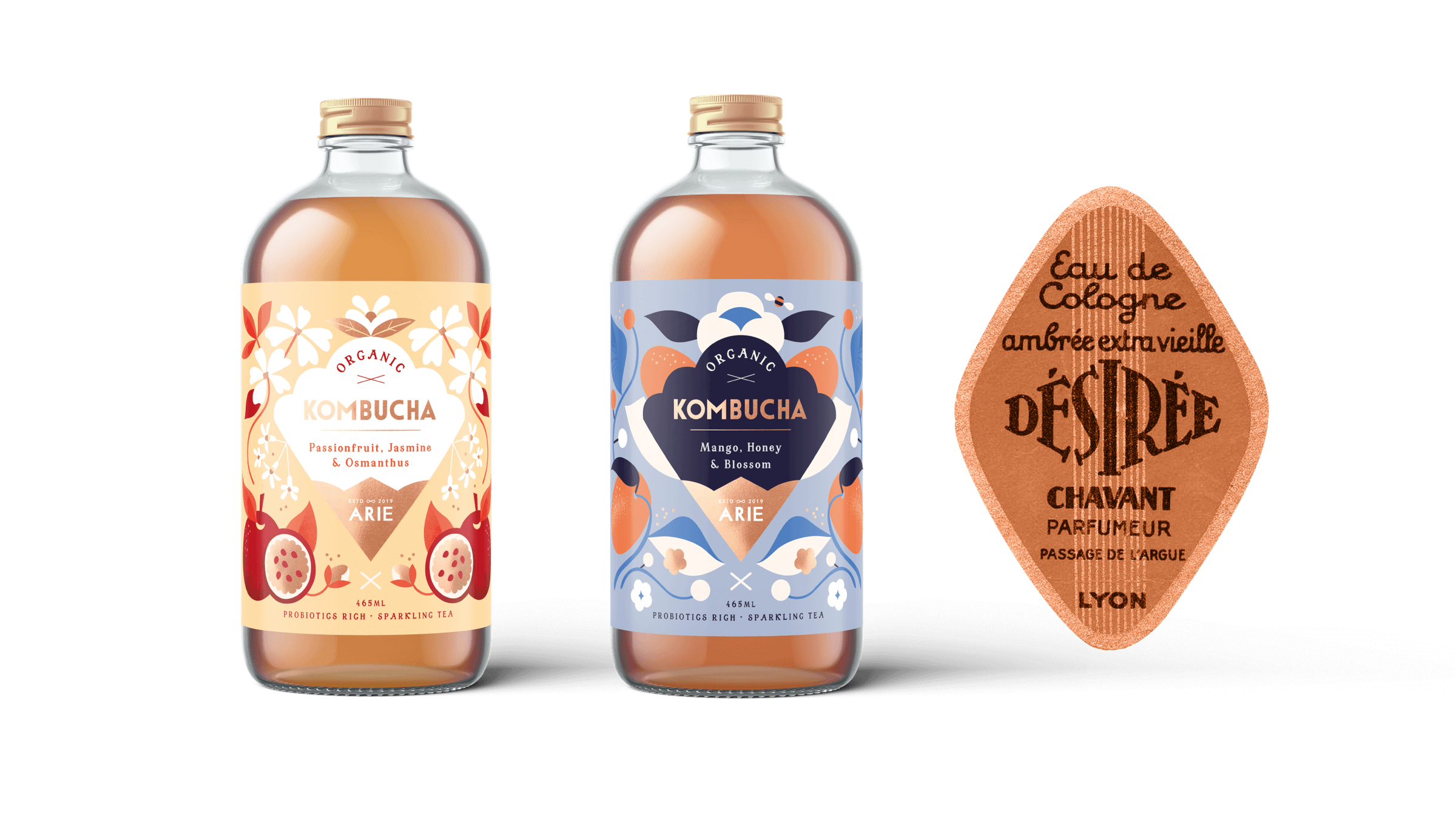
Tasty illustrations for Arie Kombucha
Arie Kombucha
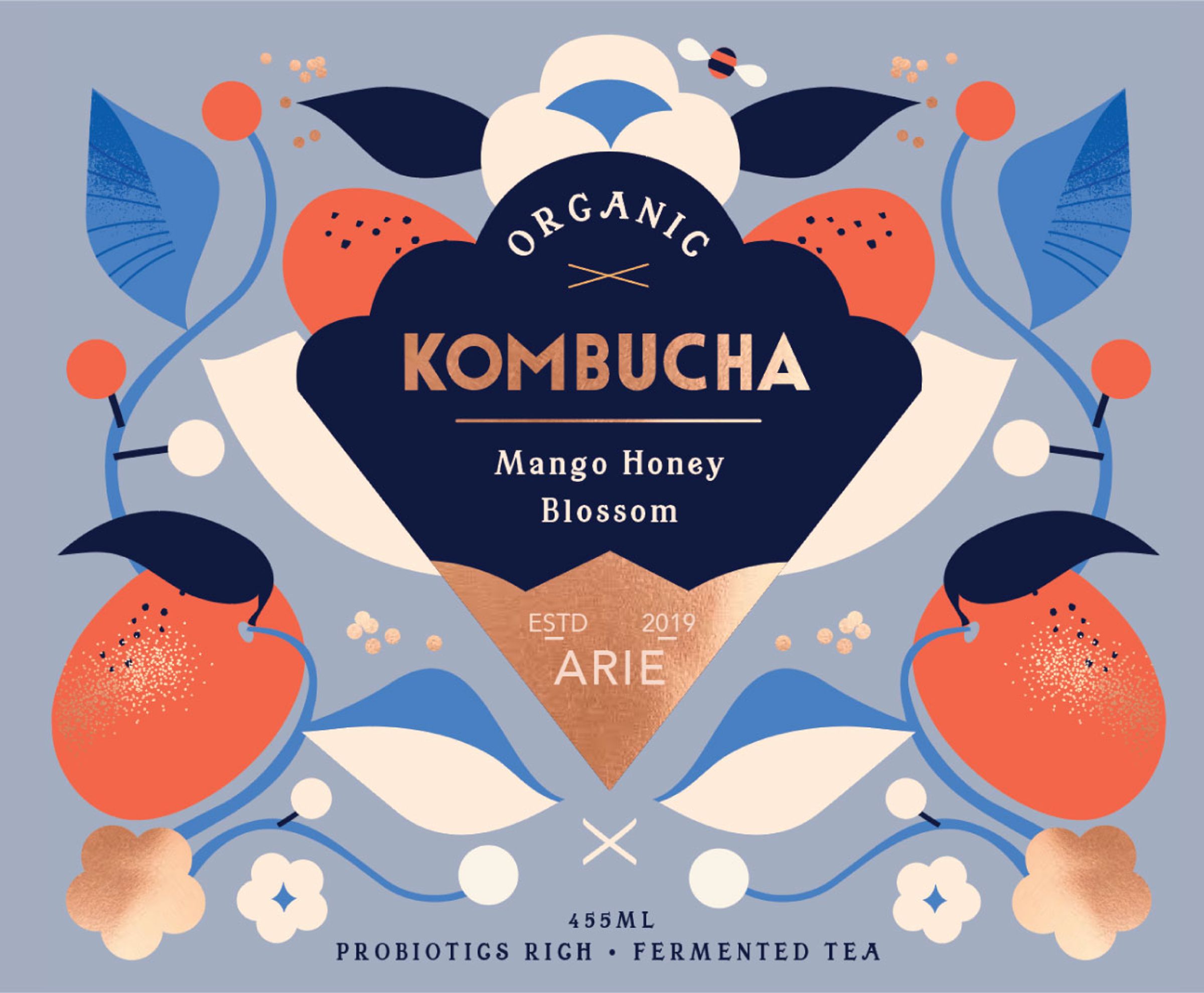
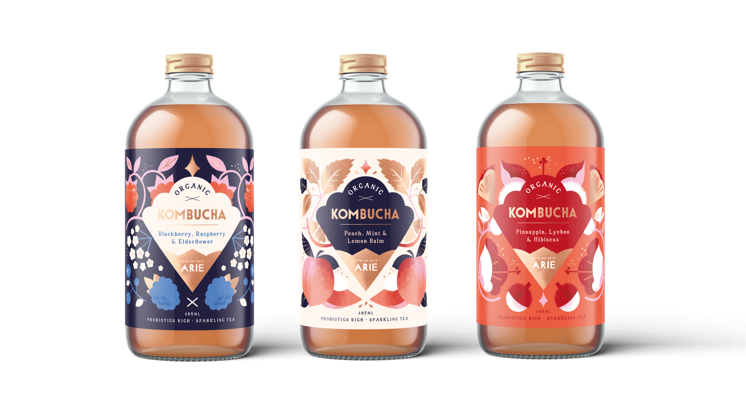
The Arie Kombucha series features six vibrant, fruity, and tangy flavors. Kombucha, a fermented tea known for its distinct taste and potential health benefits, contains probiotics that support gut health and digestion. Rich in antioxidants, it helps detoxify the body, reduce inflammation, and strengthen the immune system by fighting harmful bacteria.
Working on this project was an exciting challenge, as kombucha is a relatively new and trendy innovation. The design not only needed to stand out on the shelf but also contribute to shaping this emerging category—a role we, as designers, were eager to embrace.
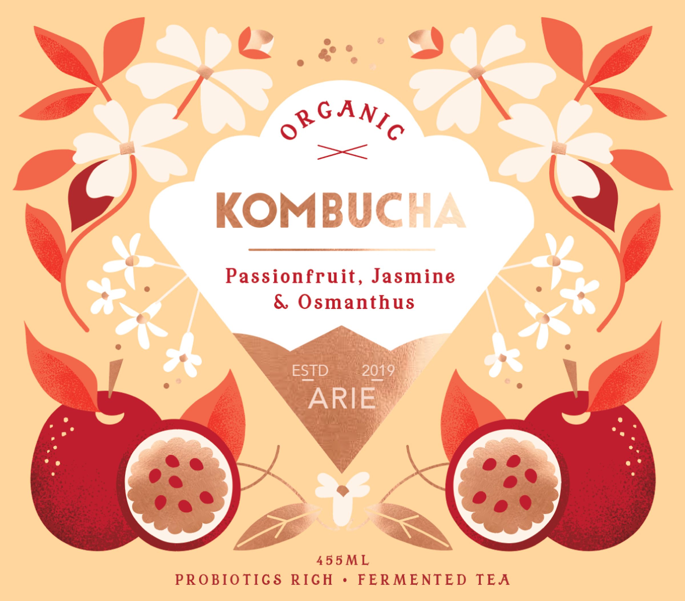
For the labels, we aimed to capture the essence of this bold, fruit-filled, and exclusive beverage. Our goal was to create a decorative yet modern look, subtly inspired by the vintage Mimosa-style labels of the 1920s, while adding a contemporary twist.
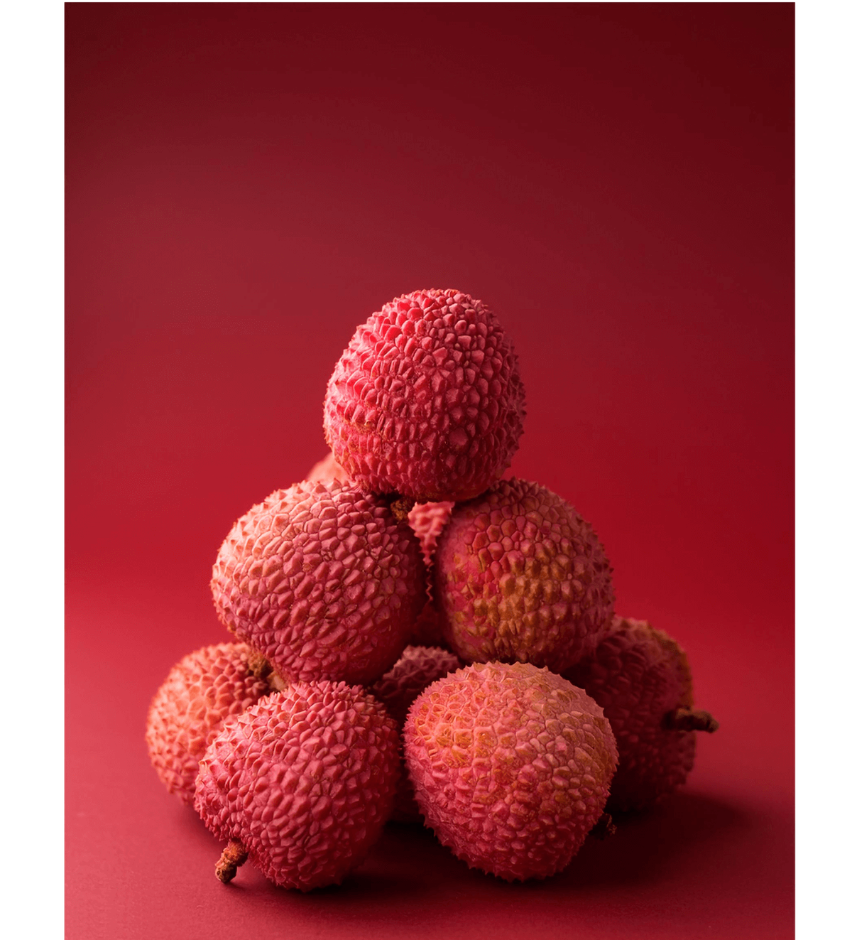
When we started the project, the client shared visual references from our portfolio, focusing on ingredients and decorative elements. With plenty of creative freedom, we were excited to design the visual identity for this range. Along with botanical elements, we also wanted to bring in touches inspired by classic drink labels from the 1920s.
Although a template was provided, we chose to adjust the layout to better complement our illustrations, giving the design a fresh, unique feel. After several rounds of refinement and collaboration, we were happy that the client loved the final design, which closely matched our vision
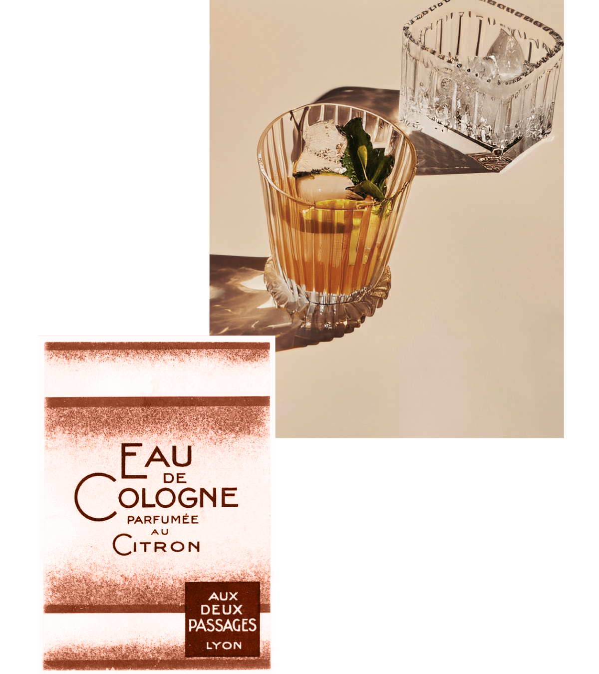
As in the majority of our design processes, we base our starting point on a vintage reference


Our goal was to design a decorative yet modern label—one that honors past elegance while feeling fresh and contemporary

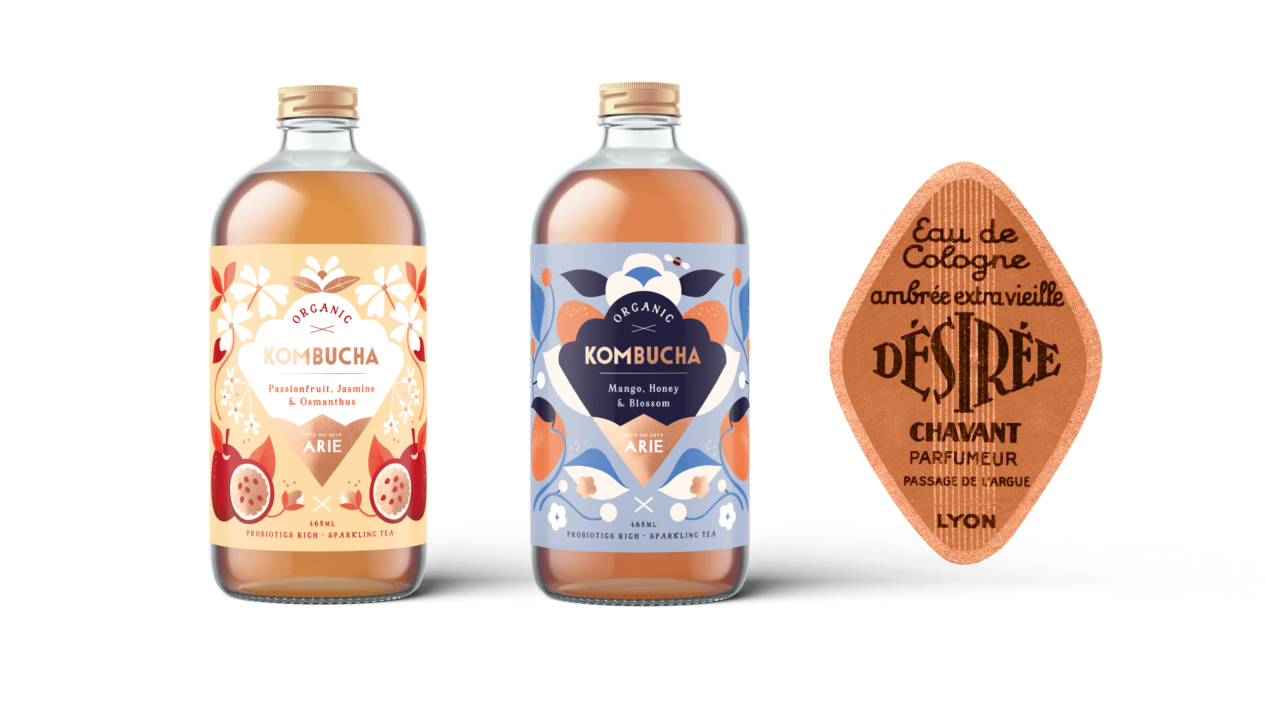


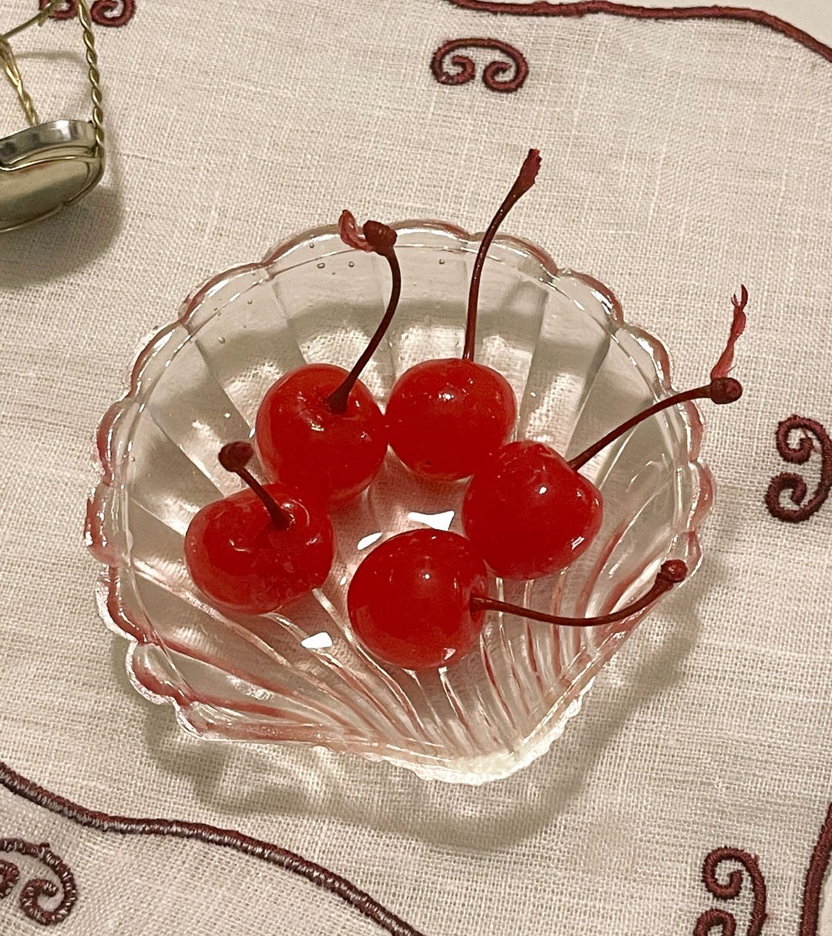
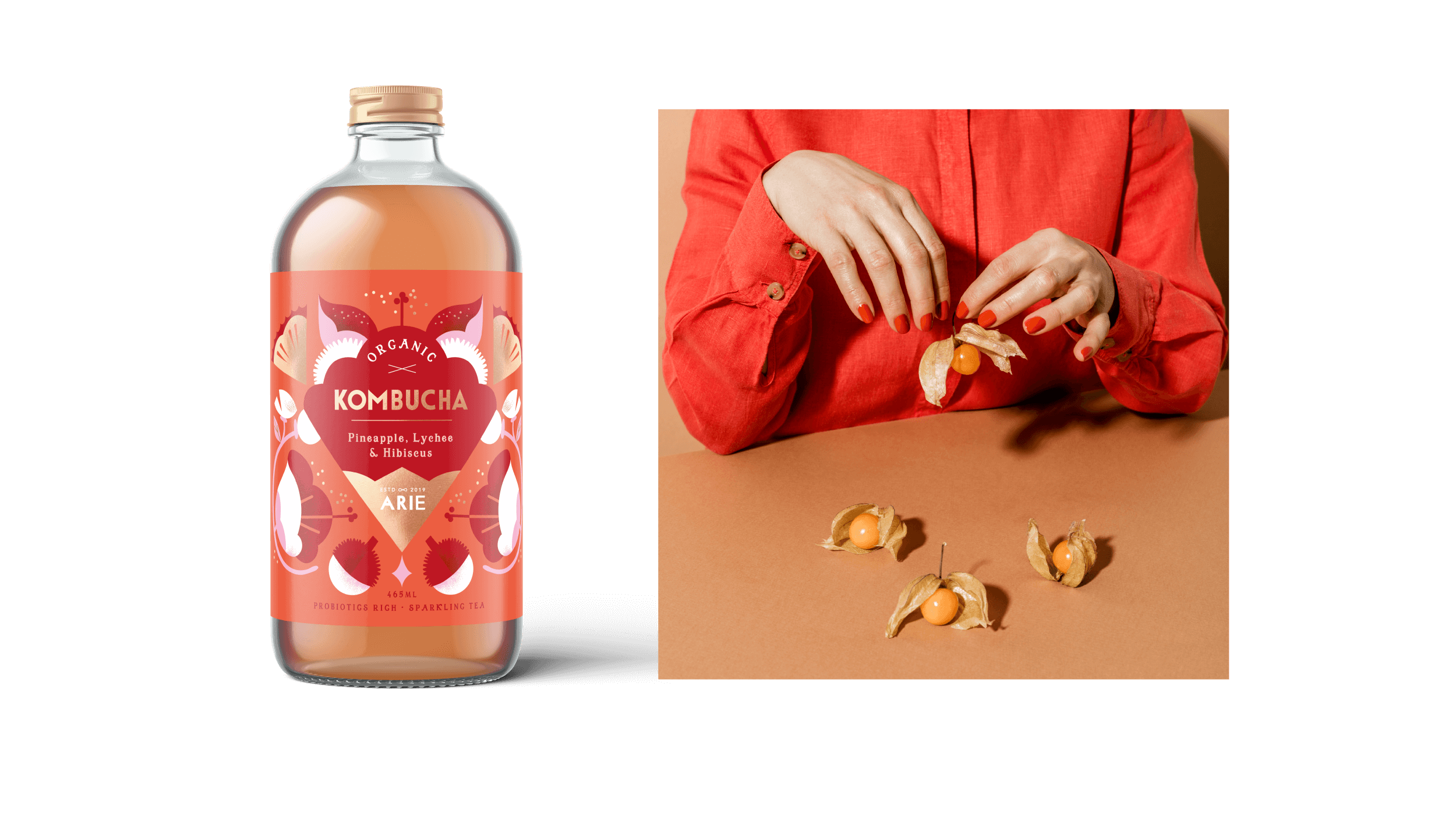
Images by: Cherry in seashell photograph by Katrin Koschitzki, Vintage perfume labels: source unknown
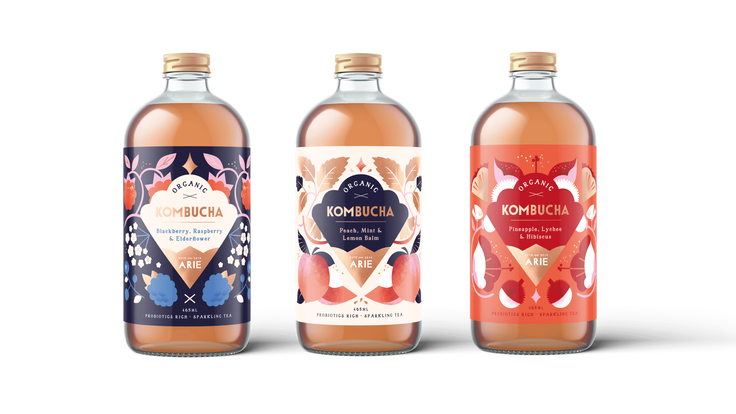
Launched in Malaysia in 2020, the Arie Kombucha series debuted with five original flavours, each wrapped in a label that captures both the playful and sophisticated nature of the product. Later, a sixth flavour was added to the kombucha universe.

As in the majority of our design processes, we base our starting point on a vintage reference
When we started the project, the client shared visual references from our portfolio, focusing on ingredients and decorative elements. With plenty of creative freedom, we were excited to design the visual identity for this range. Along with botanical elements, we also wanted to bring in touches inspired by classic drink labels from the 1920s.
Although a template was provided, we chose to adjust the layout to better complement our illustrations, giving the design a fresh, unique feel. After several rounds of refinement and collaboration, we were happy that the client loved the final design, which closely matched our vision

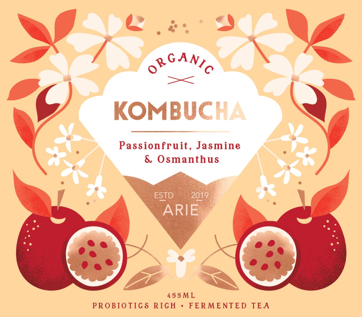
Our goal was to design a decorative yet modern label—one that honors past elegance while feeling fresh and contemporary
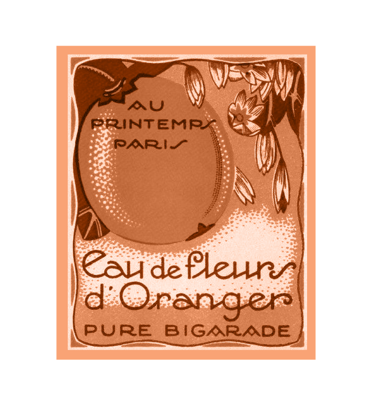
Images by: Cherry in seashell photograph by Katrin Koschitzki, Vintage perfume labels: source unknown

Launched in Malaysia in 2020, the Arie Kombucha series debuted with five original flavours, each wrapped in a label that captures both the playful and sophisticated nature of the product. Later, a sixth flavour was added to the kombucha universe.
Related projects