Cookbook on wholesome everyday dishes
Frisk Forlag
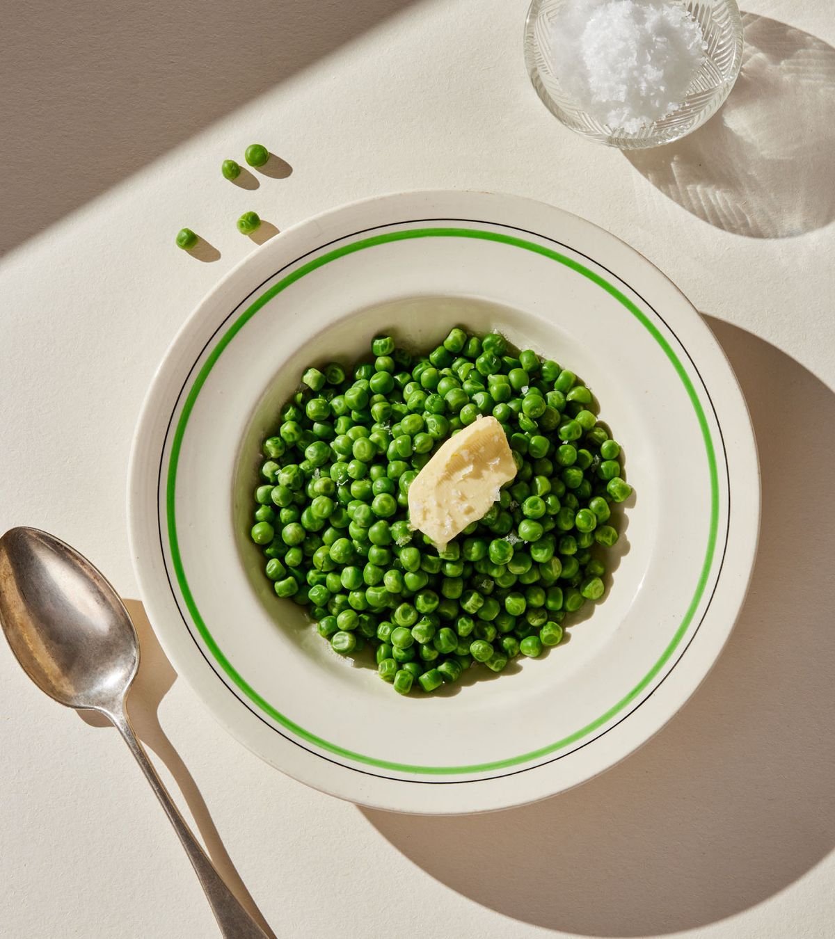
While working on Kokeboka, it was important for us to find the right balance between what we felt looked best and the authors’ ideas about what food is—and should be. The recipes are simple and focus on pure, unprocessed ingredients. These raw ingredients have a natural beauty that doesn’t need fancy decoration.
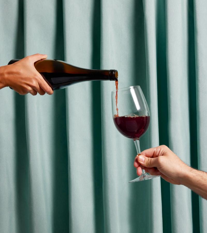
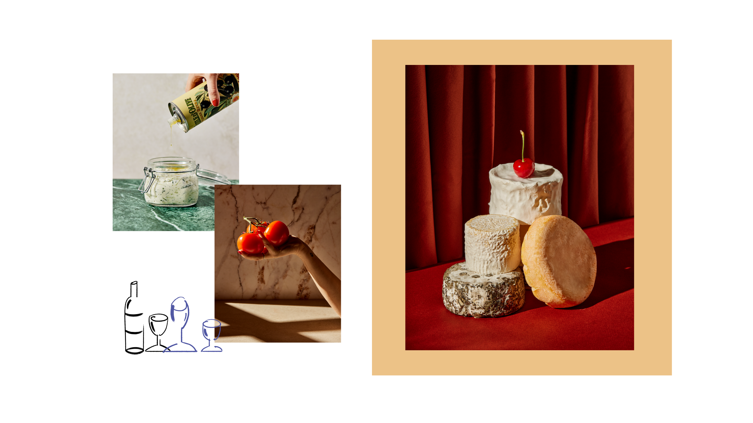
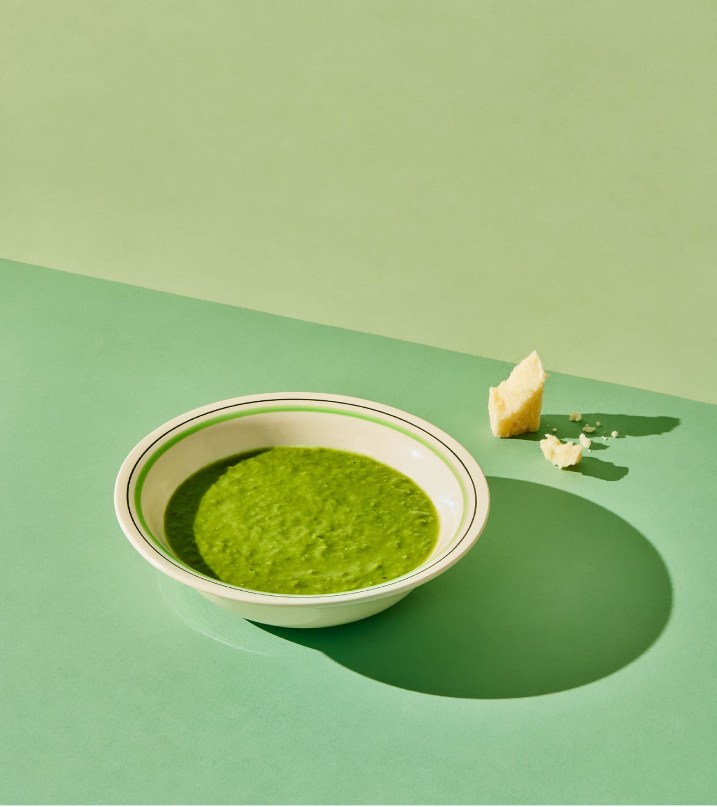
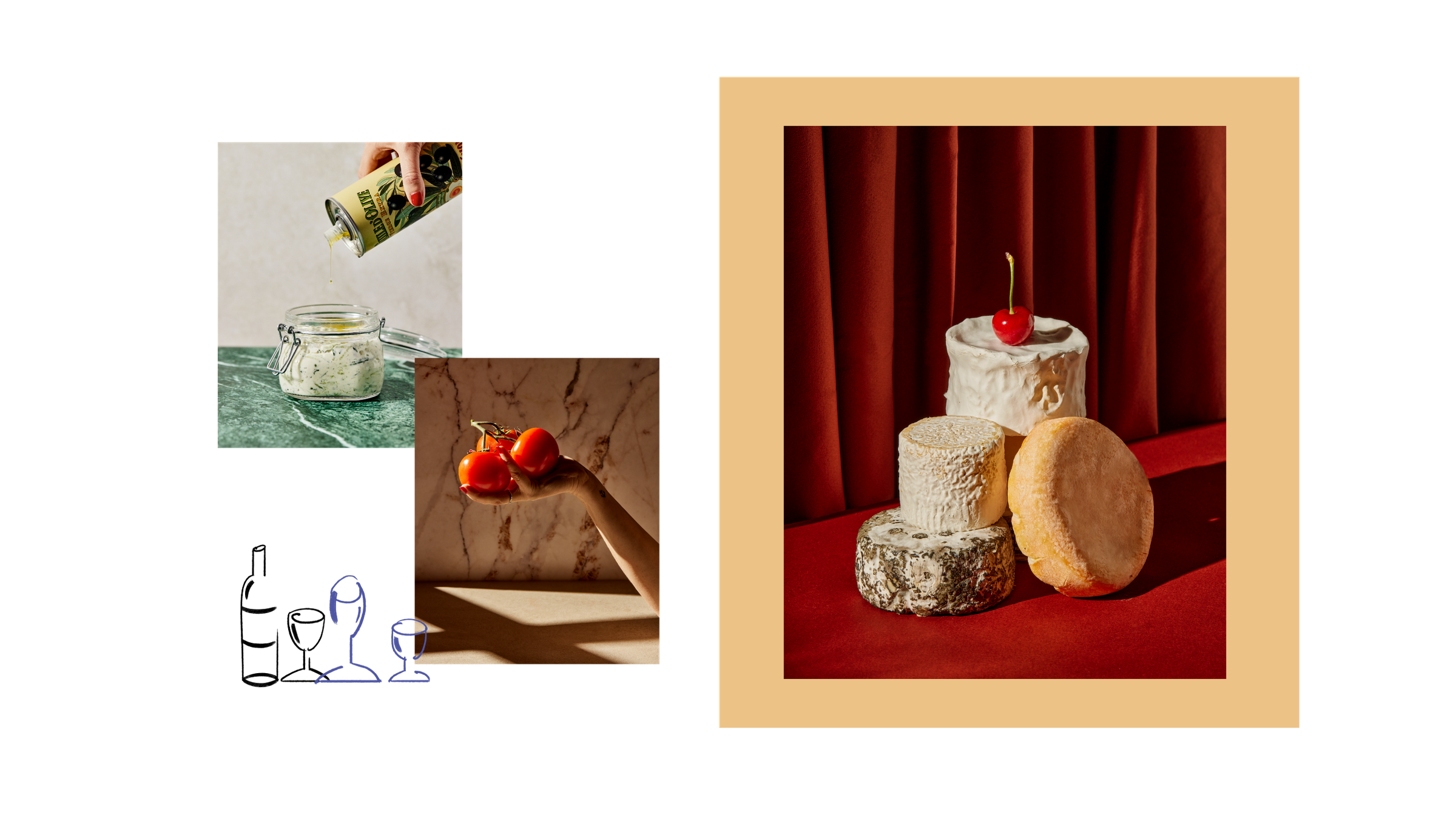
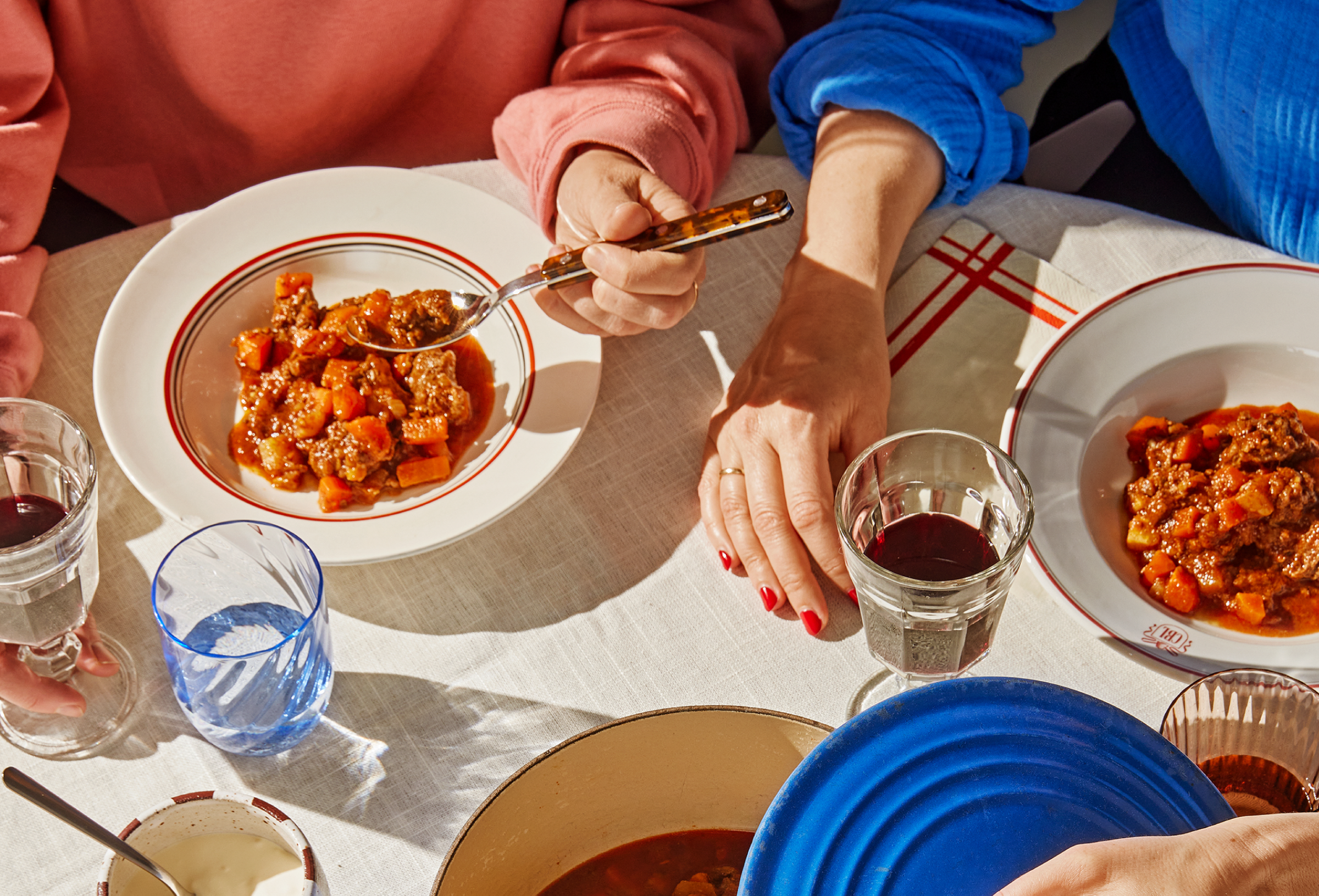
Because of that, we kept the food styling simple. We used lighting as our main tool in the photos, rather than lots of props or decoration. Throughout the project, we reminded ourselves what this book is really about—not Hellstrøm’s lobster bisque or a trendy hipster in a beanie in Copenhagen, but fish gratin and practical women working to teach people about food.
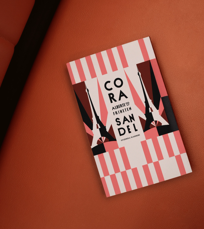
With that in mind, we made our visual choices. We picked the cover illustration because we wanted it to remind people of a classic cookbook—with Norwegian values, heirloom china, potato harvests, and good old common sense. Our goal was to make it feel relaxed and fun, while celebrating the simple joy of food.
At first, we weren’t sure about the book’s direction or structure, but we soon agreed to embrace simplicity—something we need in daily life
— Marit Kolby
As Art Directors on this project, our challenge was to avoid getting lost in the vast landscape of food-related books. However, since the essence of this book is to celebrate the raw, nourishing, and stunning variety that nature provides, the styling concept had to stay true to this vision.
The most powerful visual appeal is often the simplest—playing with light and shadow to highlight natural beauty. For us designers, who spend so much time in front of our Macs, it was a joy to step away from our screens and to be on set, surrounded by props, crockery, and rich colors. While ensuring that the overall aesthetic stayed cohesive, we were fortunate to work with a fantastic team.
All the images in the book were captured by photographer Tommy Andresen, with illustrations by Spanish artist Sandra Navarro.

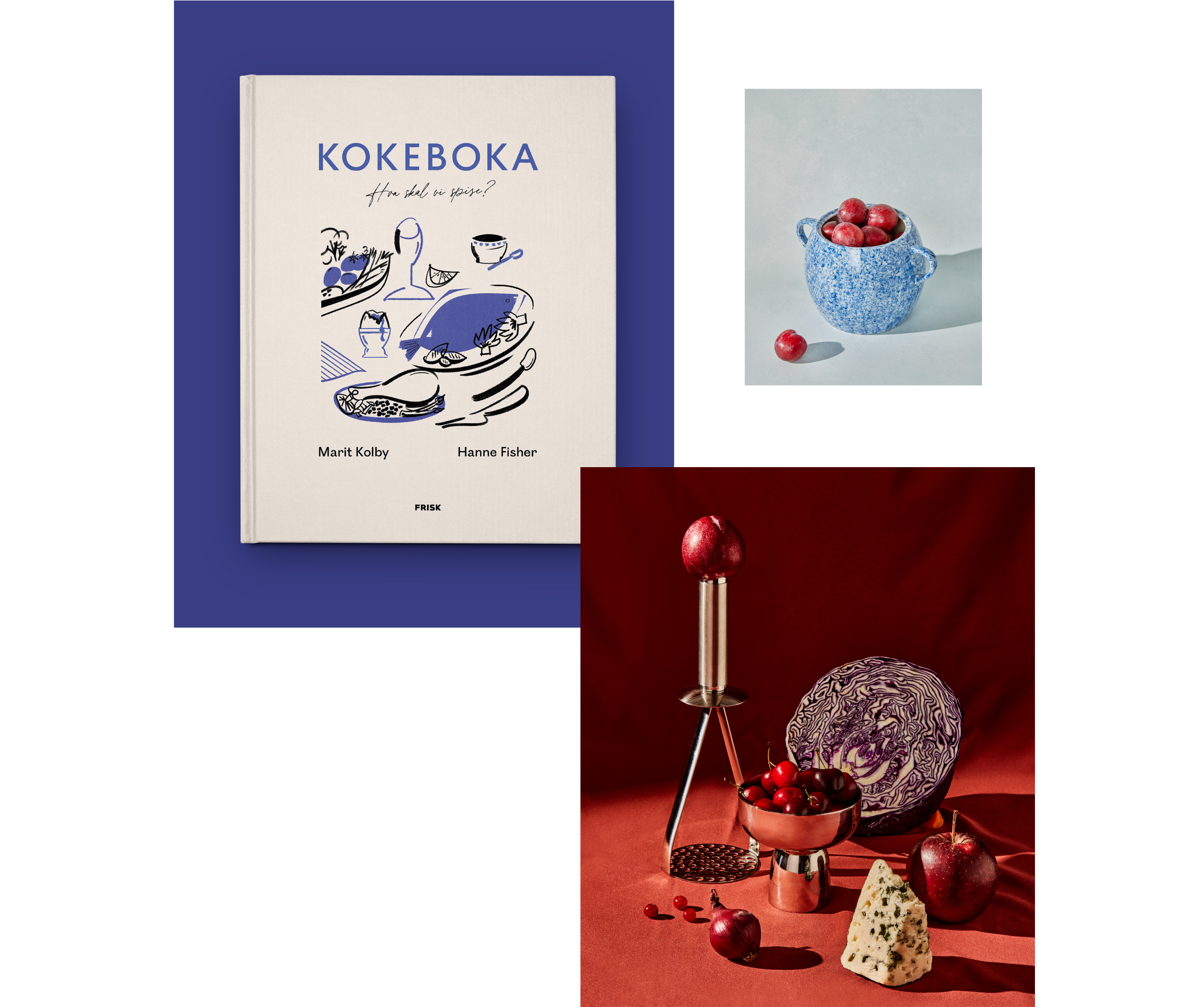

The idea behind the photographs was to create a classic, painterly quality—reminiscent of a still life or a traditional tableau by past artists. A homage to both the timeless beauty of food and art, but with a modern twist.
The recipes here are designed for practicality, not to impress
-Marit Kolby

As Art Directors on this project, our challenge was to avoid getting lost in the vast landscape of food-related books. However, since the essence of this book is to celebrate the raw, nourishing, and stunning variety that nature provides, the styling concept had to stay true to this vision.
The most powerful visual appeal is often the simplest—playing with light and shadow to highlight natural beauty. For us designers, who spend so much time in front of our Macs, it was a joy to step away from our screens and to be on set, surrounded by props, crockery, and rich colors. While ensuring that the overall aesthetic stayed cohesive, we were fortunate to work with a fantastic team.
All the images in the book were captured by photographer Tommy Andresen, with illustrations by Spanish artist Sandra Navarro.
At first, we weren’t sure about the book’s direction or structure, but we soon agreed to embrace simplicity—something we need in daily life
— Marit Kolby

The idea behind the photographs was to create a classic, painterly quality—reminiscent of a still life or a traditional tableau by past artists. A homage to both the timeless beauty of food and art, but with a modern twist.

The recipes here are designed for practicality, not to impress
-Marit Kolby
Related projects